ABOUT THE COMPANY
A design-focused creative agency building innovative brand solutions that navigate seamlessly across the digital and the analog worlds.
CLIENTS
-
Client 1: Poignees D'Amour
-
Client 2: Mi & Gei
-
Client 3: Weavers Studio
INDUSTRY MENTORS
Alvina Rajendran
Art Director/ Senior Designer, Branding & Packaging
Aditi Rego
Senior Designer, UI/UX
POIGNEES D'AMOUR
About the Brand
Parent brand: La French
A handcrafted home hardware brand rooted in Normandy's rich heritage, redefining elegance by blending French design and craftsmanship with contemporary touches. It transforms spaces into experiences, infusing everyday living with beauty and emotional resonance.
Brief
Rebrand Poignees D'Amour to refresh its identity and enhance its market presence. The goal is to create a traditional French , contemporary, and luxurious brand image that resonates with their target audience. This includes the redesign of all brand assets to ensure consistency and appeal across all touchpoints.
PRODUCT LOOKBOOK


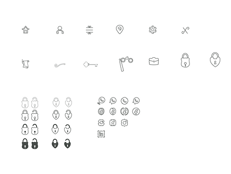
ICONOGRAPHY

Icon Explorations

Shortlisted Icons
VISUAL LANGUAGE MOODBOARD


RATIO MOODBOARD
These moodboards are derived from the visual language moodboards by taking into consideration the presence of keywords


RATIO MOODBOARD

.webp)


MI & GEI
About the Brand
Parent brand: La French
An architectural French hardware brand specializing in door handles and levers, embodying quiet luxury for a niche market. Community-driven, it highlights craftsmen's efforts, aiming to create an environment where opening a door feels like entering a world of curiosity.
Brief
Rebrand Mi&Gei to refresh its identity and enhance its market presence. The goal is to create a contemporary, and luxurious brand image that resonates with their target audience. This includes the redesign of all brand assets to ensure consistency and appeal across all touchpoints.
BRAND LOGO EXPLORATIONS


VISUAL LANGUAGE REFERENCES


WEB LANDING PAGE UI


MOBILE LANDING PAGE UI


COLOUR PALETTE ITERATIONS


WEAVERS STUDIO
About the Brand
Based in Kolkata, this fabric brand specializes in weaving its own materials and is renowned for its dyeing, weaving, and other fabric techniques. The brand empowers handloom artisans by creating fabric through traditional methods.
Brief
To refresh Weaver Studio’s identity and enhance its market presence by rebranding their website and mobile app.
WRSC LOGO

PROMOTIONAL VIDEO

THOUGHT CAPSULE

"My first real dive into the design world—and wow, was it eye-opening. I jumped into brand and identity work for international clients, where every day felt like learning on the go. Some days I brainstomed on designing brand collaterals while other days tweaking color palettes. As I got into the flow of professional world, asking questions, iterating alongside seniors, discussing ideas, I realized design is also about collaboration and curiosity. Most importantly, this internship taught me that confidence is cultivated in real time, alongside real people and real feedback."

